In Part 1 of our coverage, Ryan gave us a comprehensive overview of the grand opening of the new Marriott Renaissance Denver Downtown City Center Hotel that has been carefully crafted out of the historic Colorado National Bank building at 17th and Champa in Downtown Denver. In this post, we’ll add a few more photos of the project and some additional observations.
This project is a HUGE win for Downtown Denver. Take a classically historic building and transform it into a new hotel, with the modifications approved by the Denver Landmark Commission:
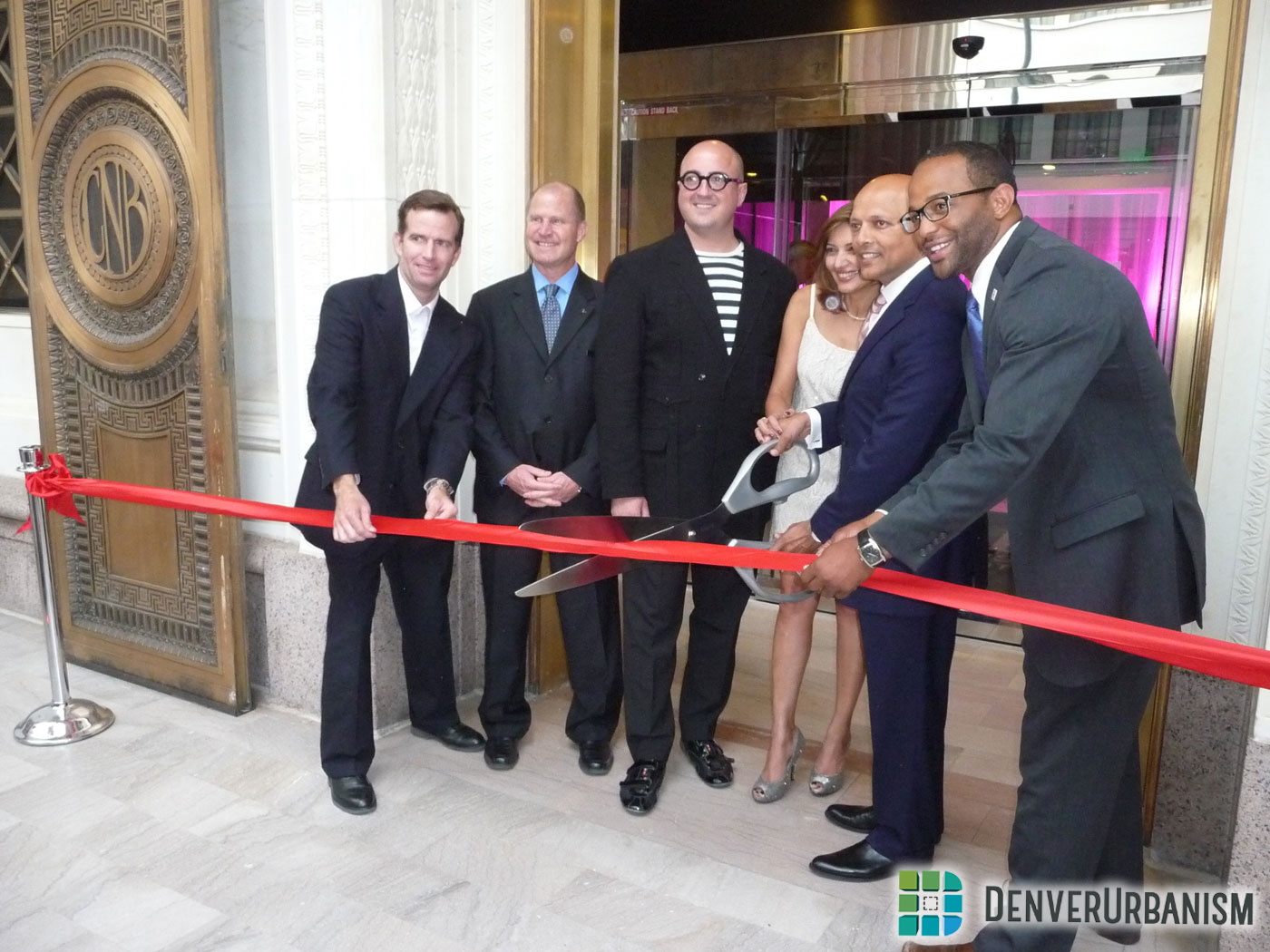
This building was vacant for about a decade. Thanks to Stonebridge Companies and the Denver Urban Renewal Authority, this historic building was transformed into the beautiful building it is today. Here’s a photo of Councilman Brooks and others from the development team cutting the ceremonial ribbon on June 5, 2014:
A few more images of the building at grand opening:
If you haven’t yet checked out the inside of this awesome historic structure, featuring a stunning three-story atrium of white marble colonnades and a series of historic murals by Colorado artist Allen Tupper True, I highly recommend you do. The lobby bar and the hotel’s restaurant, Range, are fantastic.
While infill development is a big part of Denver’s growth as a city, adaptive reuse projects like the Marriott Renaissance Denver Downtown City Center hotel are equally important to Denver’s urban evolution and preserving its heritage as a major city.


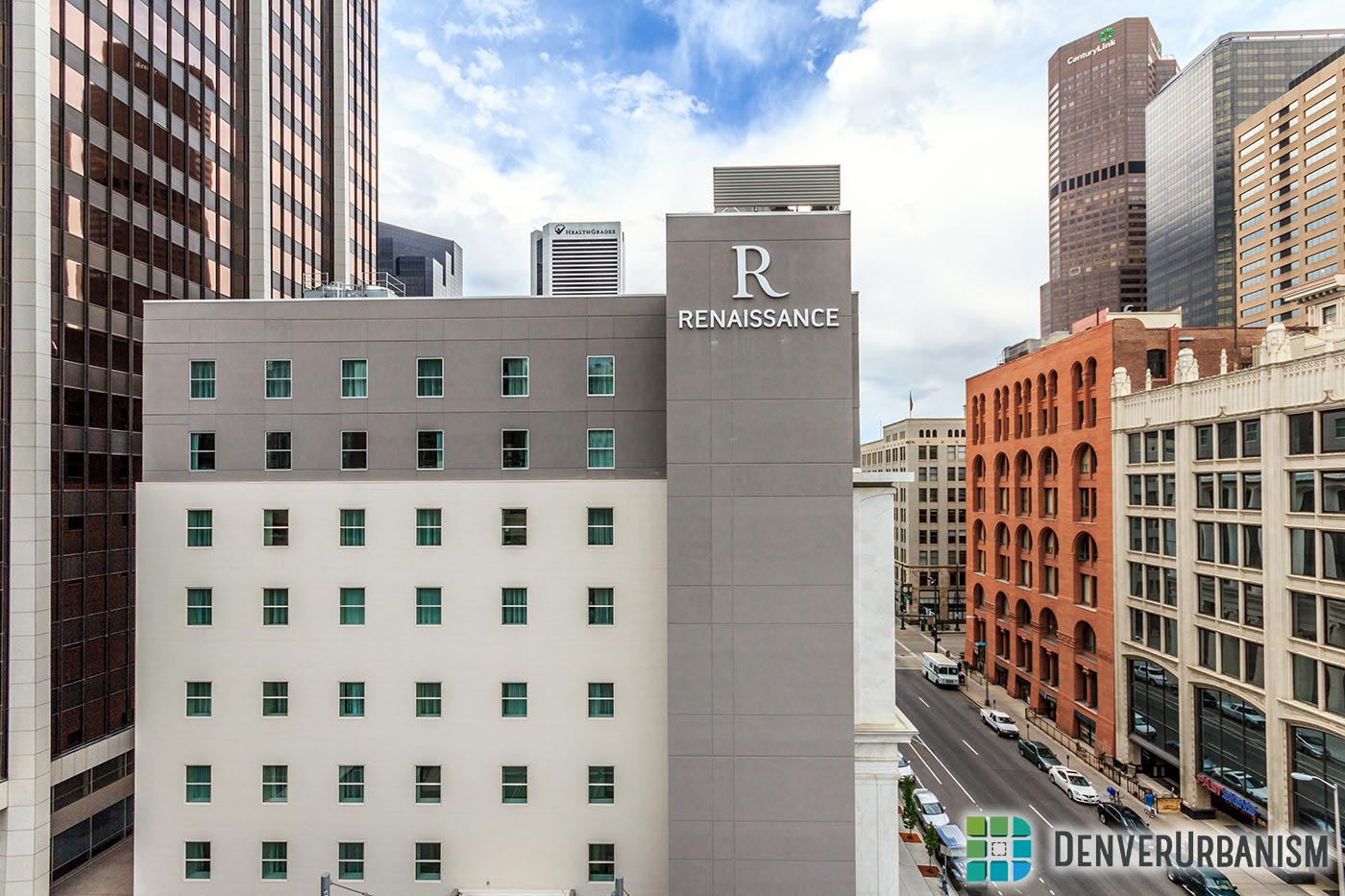
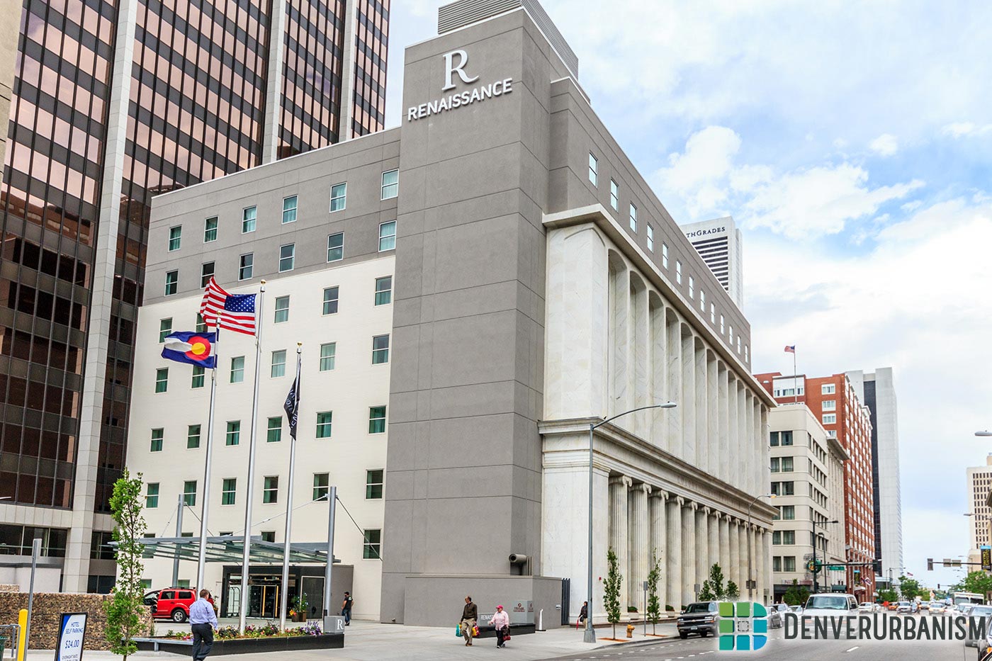
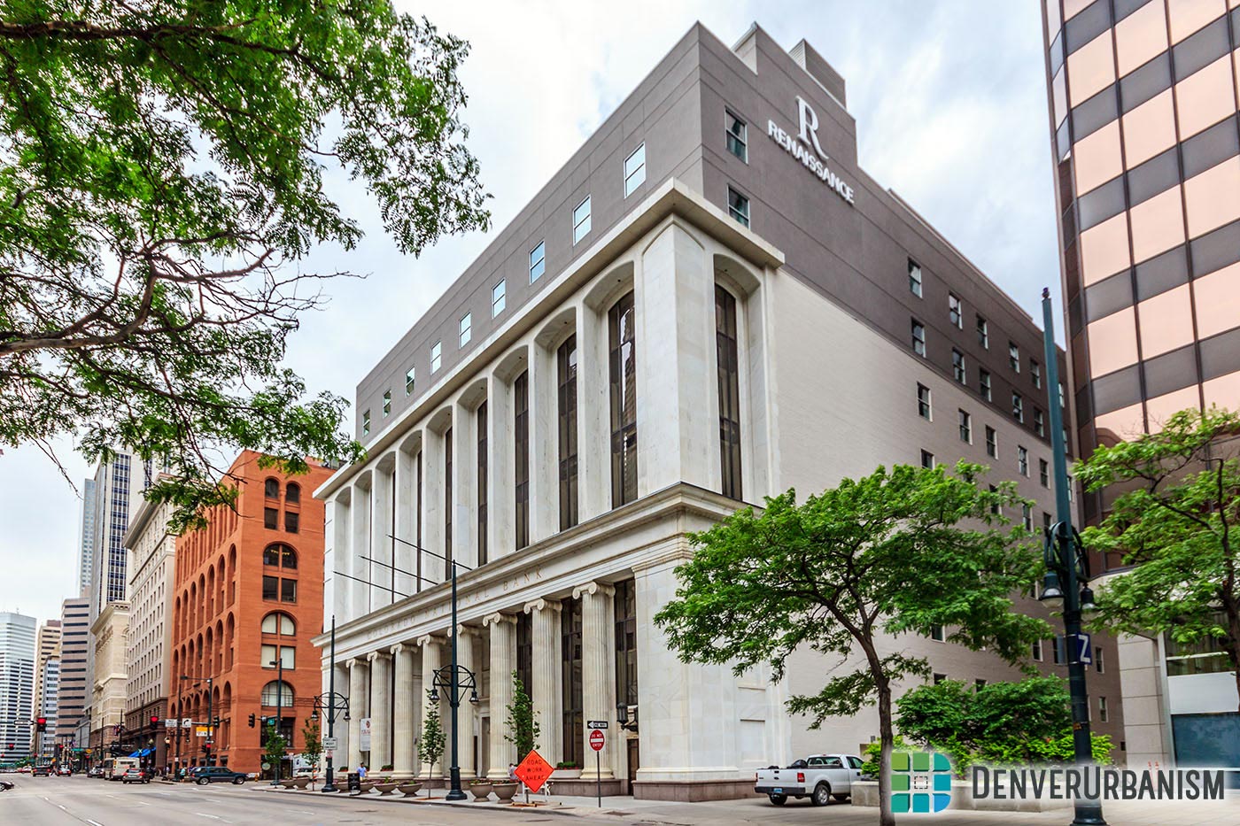





Is that a trailer park on top of that gorgeous historic building?…Oh, forgot, on this site we’re not supposed to criticize horrible architecture masked as progress.
I’m not a big fan of the rooftop addition either.
I guess it’s one of those “could be worse” situations. Is an incongruous pop-top better than the building being turned into a Scientology temple (or remaining dormant and vulnerable)? Yes (shrug)?
In ten years (or sooner), that stucco on the top two floors is going to look shabby, and will need to be re-done. That will be the hotel’s opportunity to get it right, re-facing it with white marble tile, or something. Great project otherwise, however.
It’s not so much the surfacing which is the problem, it’s the boxiness.
The original building did something very smart: it has curved shapes. Round columns, gently curved lintels, etc.
http://www.fastcodesign.com/3020075/why-our-brains-love-curvy-architecture
The addition is square and boxy. Round off those window frames and put something curvy on the top and everyone will call it beautiful.
It’s just an understated addition that doesn’t detract from the original.
Good comments Ken. I had forgotten how long it had been vacant. Hats off to Stonebridge for accepting the challenge to bring this historical gem back to life.
Although the interior is terrific, I am still appalled that the just used synthetic stucco for the exterior. If the extremely unimaginative addition design was just covered with slate or another stone the same color gray it would have been soooo much better. Then at least it would be appropriate with the marble of the rest of the exterior.
I like the contrast in color between the top and historic lower part, but do think they went a little too plain. But the renovation of the inside and the hotel entrance on the west side eating into the old parking lot more than makes up for the miss IMO.