Back in December we took a look at the old Xcel Energy office building that was being converted into a dual-brand hotel. Since then, the project is now complete and both hotels are open. This is also the first dual-branded hotel to open in Downtown Denver containing the Homewood Suites and the Hampton Inn & Suites.
I had to capture this building at both day and night. The street presence this building adds to this segment of 15th Street is phenomenal, especially at night given this is a very dark not-so-pedestrian-friendly area in our downtown. This is a 12-story building that is divided in two for each hotel. The Hampton Inn will have 120-units occupying floors 2 through 5, and the Homewood Suites will occupy floors 6 through 12 with 182-units. There are two separate check in desks but the amenities, pool and fitness room, are shared.
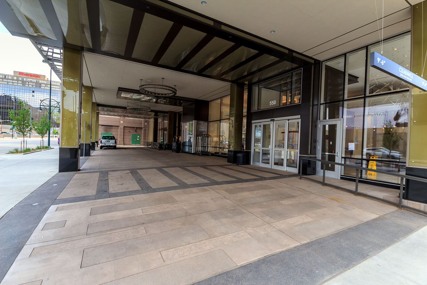
There is a drive-up valet loop which does require cars to cross over the sidewalk just like its next door neighbor, the Hyatt Regency. In these two pictures alone, you can clearly see how this building engages the street level much better than how it used to. It’s also all about the details between the artistic awnings, lit columns and blue accented entryways.
Heading down Welton, you will find an outdoor patio and entrance to the hotel bar. The lobby has also been opened up. When walking around the building, you will have floor-to-ceiling glass views of the lobby.
This adaptive reuse project is something this segment of 15th Street really needed. Between the new protected bike lane and the aLoft under-construction, this street is beginning to see a transformation that will help enhance the pedestrian experience on 15th Street.


Wow! The difference is remarkable! I would never have thought there would be any hope for this building.
What a remarkable improvement to the streetscape. I wonder what the rooms look like with those funky tall windows. Also, those windows are much better suited to a hotel than office space anyway.
I like how they redid the lobby, but I can’t help but feel that this project is simply putting lipstick on a pig. Ugly building, and nothing will change that.
Yes, remarkable results to keep with a good theme.
I had wondered recently what was going on with this building. I thought they had started it, but… Nice work, Ryan, and thanks for both the day and night shots. They really tell the story.
That first floor re-do is really, really remarkable…who was the architect that designed it? maybe you should start an annual “Denver Infill Award” and give this one to the streetscape category…very well done!!
We have interior shots on our Facebook page.
https://www.facebook.com/pages/Design-Force-Corporation/132352973631998
Here are some of the main players:
Arch: Pahl Arch (Denver)
Interior Design: Design Force (Denver)
GC: Alliance (Denver)
Bryan and Justin,
The exterior design and adaptation was concieved by Stantec ViBE, formerly CommArts, in Boulder. Pahl Architects was the Architect of Record and Design Force was responsible for the interior desing in collaboration with Pahl Architect. The GC was Alliance Construction.