Back in January we took a look at the Denver City Center project located between 17th & 18th and California & Stout Streets. The two buildings on the property, John’s Manville Plaza and 707 17th Street, have a shared plaza which is undergoing a serious renovation.
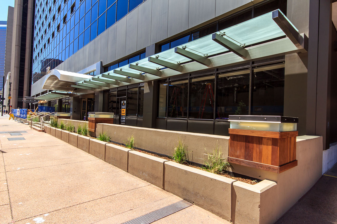
First up let’s take a look at 707 17th Street. This is a dual use hotel / office building. On the 18th Street side of the building, renovations are continuing for the office entrance; the hotel entrance is around the corner down California Street. At street level, 707 17th Street has a very modern look and feel with the opaque glass awnings along with the stainless steel arched entryways.
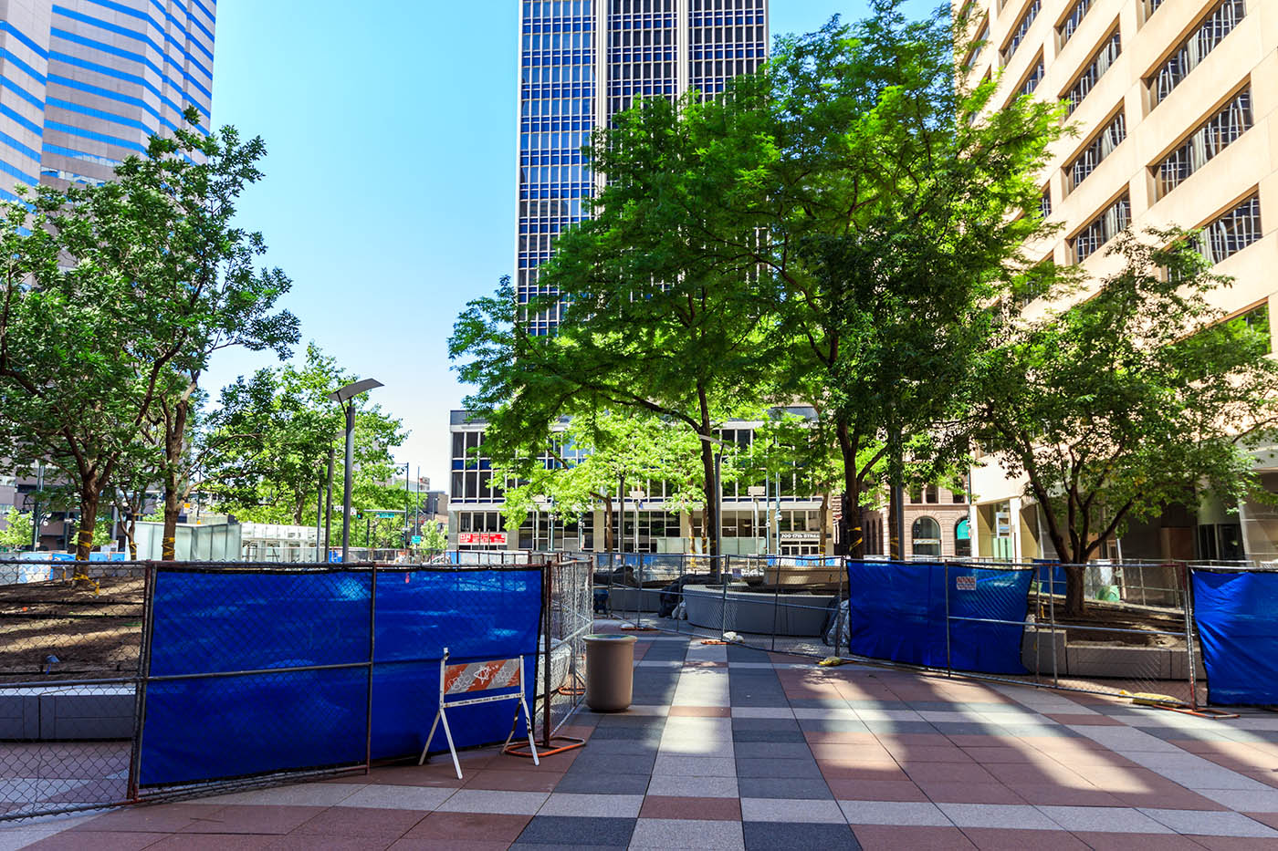
Heading around the corner you can clearly see huge improvements have been made on the plaza. New pavers have been installed along with modern lamps.
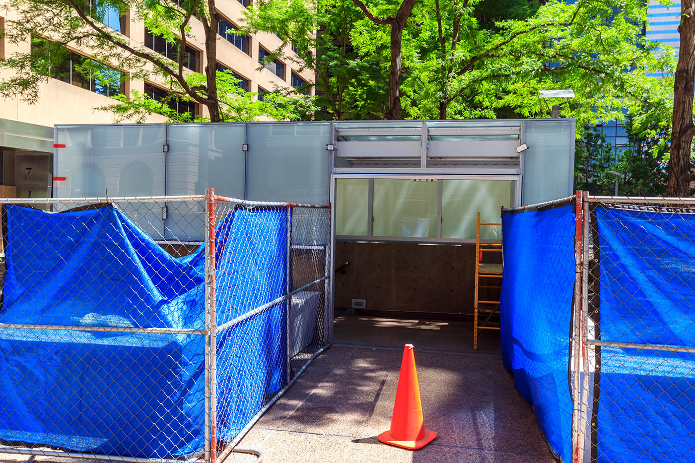
The canopies for the fire escapes have been completely redone with the same opaque glass we saw on 707 17th Street. They have also been scaled down from the original which used to have large black arches with glass in-between the supports.
Next we are going to swing around to the other side of the John’s Manville Plaza building and take a look at the improvements along Stout Street. Because of a nicely placed parking garage, I was able to stitch together a high-resolution picture highlighting all the improvements, which we will also look at up close. Make sure you click to embiggen!
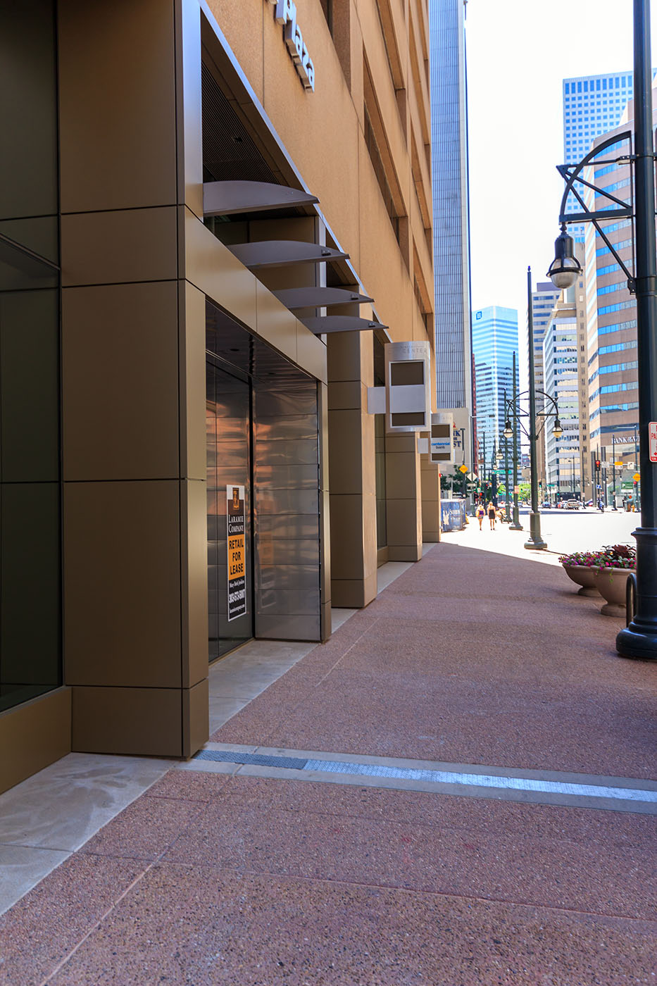
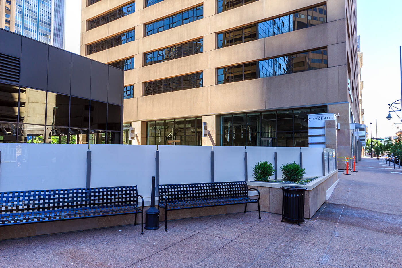
The retail space has been opened up along the building with new signs above each pad. There used be large bars in front of the retail store windows which have also been taken out making it a more seamless building to street transition.
Along Stout Street, new benches have been installed along with the same type of glass bordering the ramp to the underground parking. The new pavers are almost all installed with just little bit left to go.
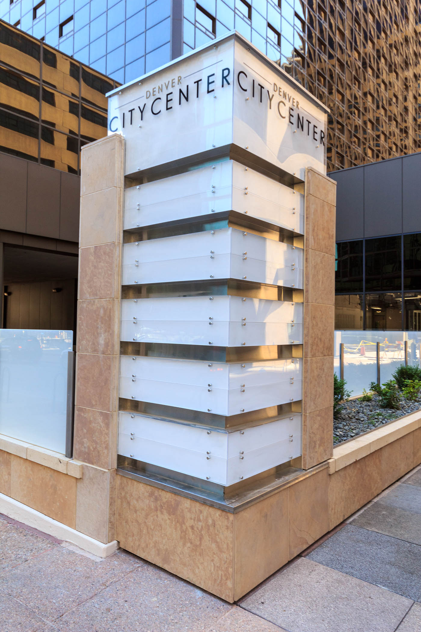
Here is what the new signage looks like with the ‘Denver City Center’ branding at the top. The theme is very consistent all around the plaza with the opaque glass and beige granite.
Last but not least, the structures for the bus shelters have started to go up. They are unlike anything else in the city so it will be interesting to see how these turn out!
This is a huge reinvestment project giving an old retro plaza and building complex a new life. We are seeing a lot of these outdated buildings and plazas get converted to support our present-day pedestrian needs which includes opening up the street level for retail along with giving the buildings a more inviting feel when passing by. Projects like this give our downtown a more vibrant feel and greatly enhance the pedestrian experience.









Thanks Ryan for your coverage on these projects! Downtown just keeps getting better and better!!
I like the bus shelters. The rest of the remodel seems very forgettable.
Taking what they had to work with; bland building etc, this is a terrific job. Major improvement to that area.
The Johns Manville plaza WAS one of the most beautiful urban office parks in Denver. The curved glass structures not only evoked the shape of the “cash register” building- the signature shape of the city skyline, they also resembled an old fashioned English conservatory greenhouse. Which is a perfect and timeless look for a city that first prospered in the Victorian age. The theme brought the charm of Larimer street into a rather soulless section of Denver’s über blah financial district. While it is true that the curved benches around the various garden islands did look dated to the mid-eighties, the deep shade from the trees and the naturalistic clumps of hostas amid impatiens and ferns provided an oasis of relaxation that was both quaint and unpretentious. Basically it was beautiful and unique and very much enjoyed by the employees from the tower and hotel. People have had wedding ceremonies there- it was that pretty. A detour through this plaza used to be like stepping out of the city and into a charming hidden respite; a peaceful green space. However I walked through the newly revised version of this space just this evening and was shocked at how utterly crappy it has been rendered. The new glass structures are hideously boring and square, the hostas and other perfectly selected shade plants have been replaced by lazy tracks of ivy (Seriously- how thouroughly tired is Ivy as a ground cover? It is like the design equivalent of sweatpants. Sure, they work just fine as leg coverings, but that doesn’t mean you won’t look like someone who has given up on life). The only improvement to this space is the slatted wood benches that have been tacked on to the curved garden beds. But even those fail because they don’t match the rest of the faux modern whatever else is now going on in there – and in fact would have been far better suited to the original design. The whole effect of this “renovated” space it that it is now a park that people will walk by without even a first glance. Unless they glance at the dumb-looking frosted glass boxes while feeling the sudden coldness of modern legibility. But whatever, at least the surrounding businesses can rest assured that people will see their signs from the sidewalk and think to themselves, “why yes I do need to go in to that place and buy something I could undoubtedly live without.” And that is really what this sad attempt at civic improvement is really all about. Congrats team- yet another unique denver space has transformed into something that is flat, open, and utterly without character.