It’s time to take a final look at the Denver City Center plaza as it is now complete! This plaza, situated on 17th and California, has gone through a major renovation and has given new life to this intersection. Here are all the previous updates for this project.
Downtown Reinvestment: Denver City Center
Downtown Reinvestment: Denver City Center Update #2
Today I have a huge photo tour covering all the new elements of this renovation. Let’s start off with the 18th Street side. 707 17th Street is a mixed use building with two entrances. Before this project, each entrance looked very different and nothing was uniform along the street. Now, both entrances are clearly marked and the same materials are used on both sides of the building: a steel and glass awning, wooden ledges, and uniform stairs.
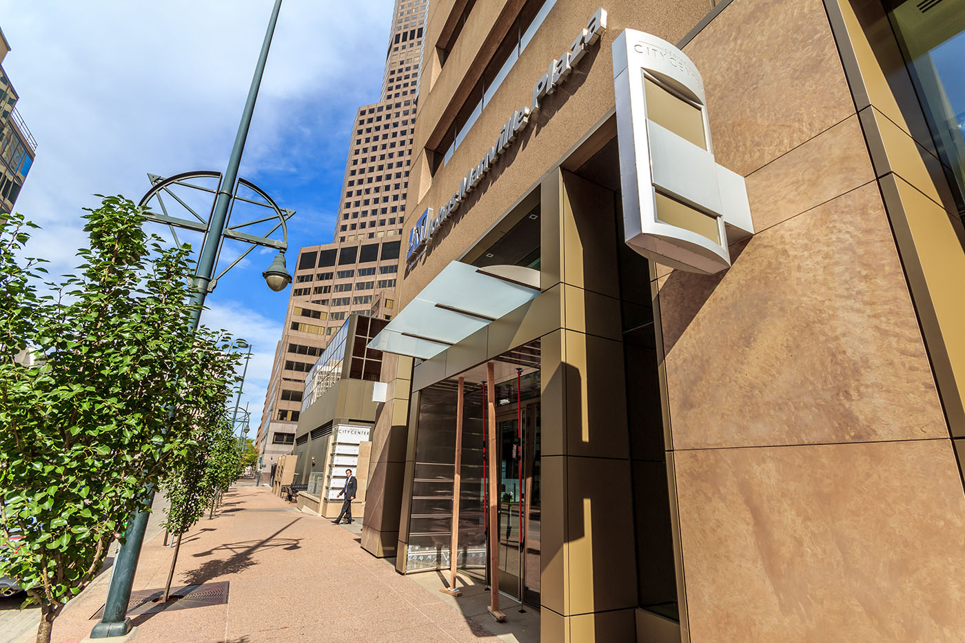
The 17th Street side is a little bit different because there are no entrances to the buildings along this street. Instead, there are glass awnings and signs attached to the Johns Manville Plaza building clearly marking the entrances to the retail.
The Stout Street side is more or less the same as 17th Street minus a new entrance to Johns Manville Plaza. There is also an inward facing triangular set of benches interestingly placed along Stout as well.
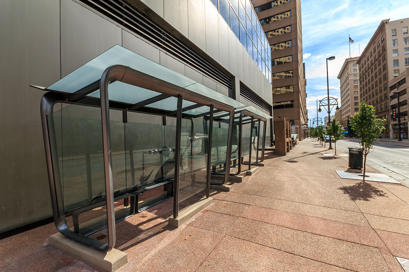
Heading towards 18th along Stout you will also find the new bus shelters. The rounded edge steel and translucent glass is a reoccurring theme throughout this whole block and it looks pretty sharp!
Here is a closer look at the outer facing ground floor retail pads. Once again, there is a translucent glass awning with ‘Denver City Center’ signage on the outside.
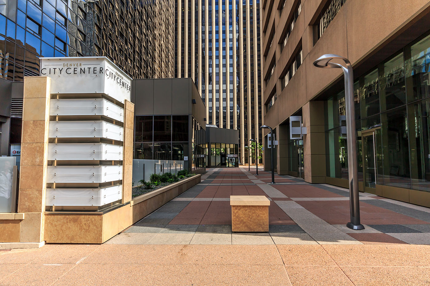
There are two entrances to the Denver City Center plaza, one off of California and the other off of Stout. Each entrance will be very well lit thanks to the new sleek street lights that were installed.
The entrances off of 17th street are also very inviting. Here you will find the same signage, bike racks, and resting areas.
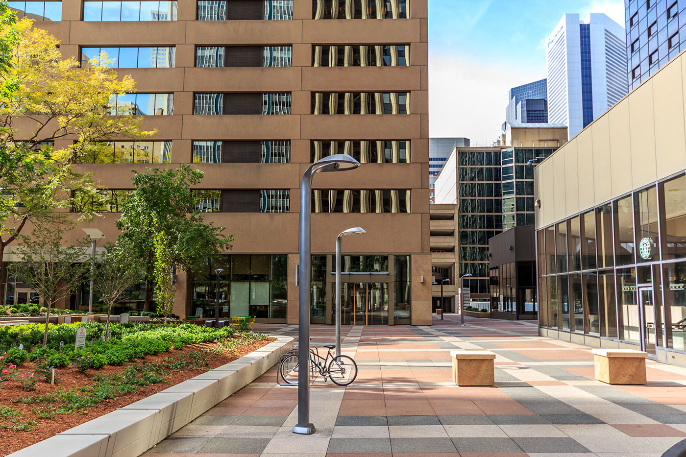
Let’s take a look at the plaza itself. Even though the idea of a plaza in front of office buildings is a thing of the past, this is a great example of what the modernization of an existing plaza should look like. There is ample seating, great tree coverage, tables and chair scattered throughout, and color patterned concrete clearly marking the plaza.
The tables and chairs are bright yellow and green adding a nice splash of color.
Wooden benches also line the landscaping bulbs for additional seating.
The landscaping is very well done with both plants and trees in each bulb. Also included on each side of the plaza is the Denver City Center Signage.
This plaza renovation is exactly what this part of Downtown Denver needed and we would all hope that it would help activate this area. Unfortunately, there is a major flaw with this plaza. Did you notice there was not one single person on the plaza even with a very busy hotel right on top of it? This is because we, as pedestrians and passersby, cannot use this plaza; it is not for public use. There is a sign, which can be missed, stating ‘Private Property, No Trespassing’. I was approached, as I was wrapping up my photo set, by a guard from Johns Manville Plaza saying it was in their ‘policy’ that I cannot take photos of the plaza. At this time, I had not seen the sign saying this was private property. Complying with his demands to move along, I put my camera away and decided to take a seat on a bench to enjoy the new look of the plaza. A few minutes later, I was approached by another guard, this time from 707 17th Street, saying I cannot be on the plaza unless I am a tenant of either two buildings. From then on, he watched me from the center of the plaza as I was taking pictures from the sidewalk to make sure I would not enter again. We have this wonderful plaza that is actually deactivating this block during non-business hours. What a shame, there is so much lost potential.





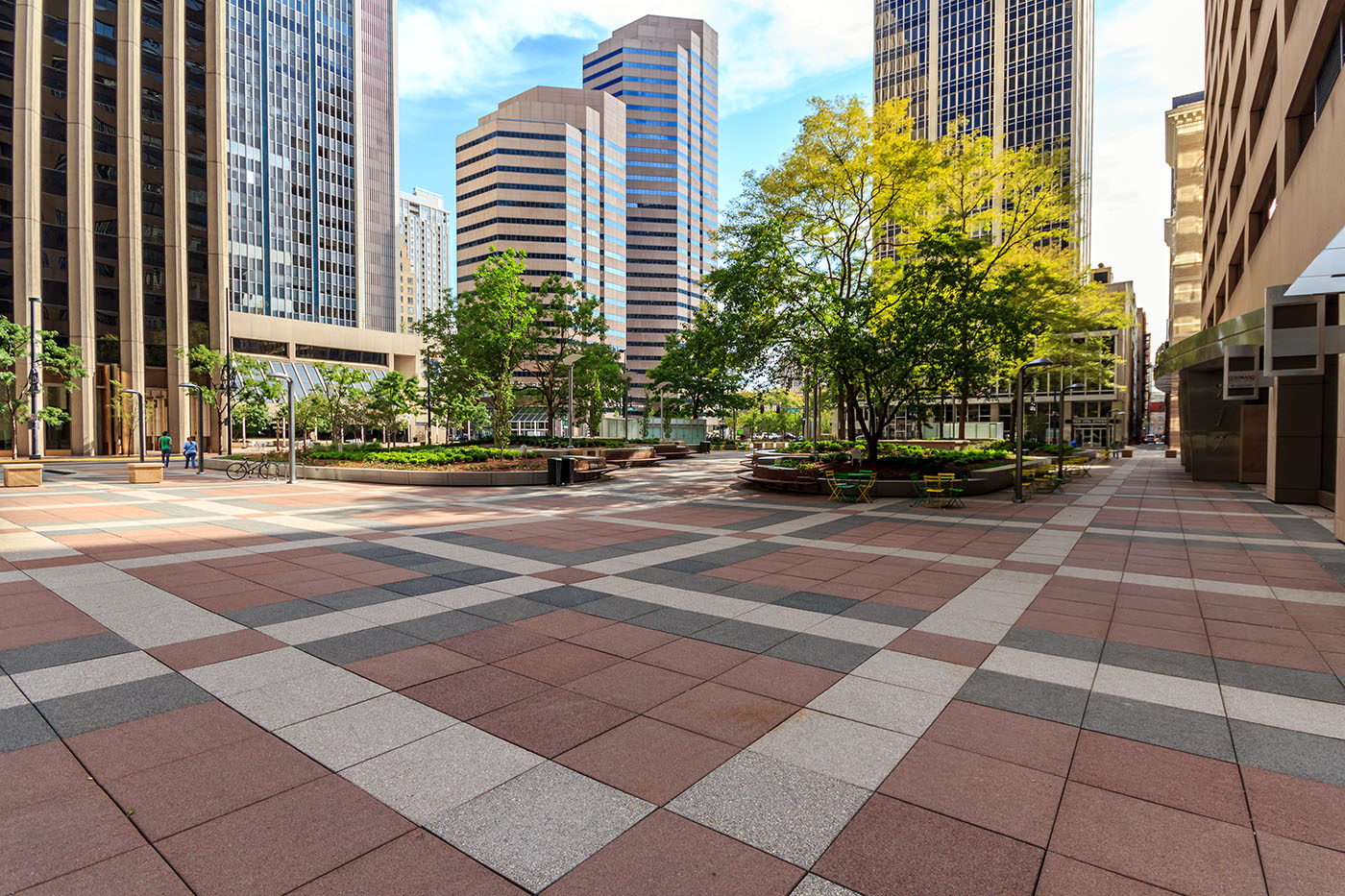


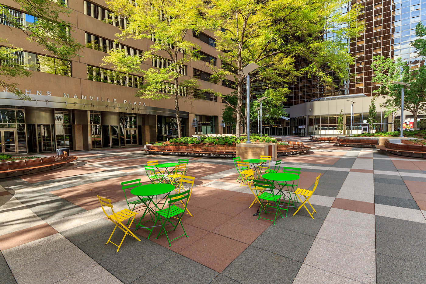




Thank you for braving the JM guard corps to bring us these excellent shots! Why would so inviting a space be off-limits to the public while also being so easily accessible? The signage is obviously ineffective and too small to deter riffraff like urban planners! What is the point of such a space?
Is it just me, or did it not really change that much. The weird unusable doors to the underground parking garage are still there (just glass now), the planters have the exact same outline, just painted, the concrete patio hasn’t change. I was really excited for all of the updates they were putting into this, but it turns out to just be paint, a couple signs, and some benches.
Dan,
Those glass enclosures are actually fire escapes for the Mariott.
It’s s shame the buildings have made the decision to police this small square and eject people from the grounds. I used to work in the Arco Tower – or whatever it’s called now and people from all over downtown regularly walked through the plaza or stopped to sit in the shade of the trees – it was always very active. If the property owners now feel that it’s necessary to prevent the public from using or even walking through the plaza, they should fence it off or post guards along California and 17th to make it clear that the public is not wanted, rather than have innocent strollers miss the miniscule sign and risk being hassled – that’s absurd. By the way, I agree with Dan – aside from a few adornments at entryways, they really haven’t done much to truly change or otherwise “reinvest” in the layout or look of the plaza area – the only thing that’s really ‘new’ seems to be the hostility of the property owners against the public.
I work across the street, and during lunch it seems pretty open to the public (my building doesn’t have a patio). I think it’s just during off-time’s they care.
Sounds like a bunch of radical urbanists should stage a sit-in.
I can remember in the late 1970s and early 1980s when this plaza, and the one across California, were busy, active spaces. The plaza across the street was the site of regular free lunchtime concerts, sponsored by the old First of Denver bank.
We slowly give up our democracy in favor of corporate interests. What a shame.
There was a concert there last week, and if you worked in one of the buildings, they were giving out hot dogs / hamburgers.
Ryan, thanks for the really detailed look at this attempt at humanizing a cold, unfriendly urban space. Mark, I also remember when this whole cluster of buildings went up, each having almost nothing to do with the others around it. The oldest, what was the First National Bank, used to have a separate elevator in the lobby, to the rooftop observation deck, when it was one of the city’s tallest buildings, at about 26 stories. It was a public attraction, in Post-War Denver, a point of pride in a young city.
Today, with the name Denver City Center on the crossroads of 17th and California, you expect a truly public space, like the one being built in front of, and behind, Denver Union Station. What you found, Ryan, was a No Trespassing message, backed up by security guards, enforcing private property lines. Architecturally, there was never a vision for these big ugly boxes, and the plaza they surround is an almost-criminal waste of public space.
Makes me dislike the name brands on the front doors, radiating corporate contempt for their very public — and shared — surroundings. When the building owners planned this spruce-up, did it even cross their minds how their location — and the name “City Center” — imply an open invitation to people on the sidewalks? Why not just post a big “Keep Out!” sign on the corner of 17th and California? Even better, surround it all with a chain-link fence and snarling dogs.
I suspect that problems with homeless panhandlers wandering through the plaza, maybe scaring hotel guests and office workers eating lunch, has lead to this ridiculous evolution into a Not Public Space in the heart of the city. This is a job for the mayor’s office, a diplomatic mission, to open the owners’ eyes to where they are.
I think it turned out nicely. A few of those courtyard photos give an almost Bryant Park feel.
Such a shame that the owners chose to prevent public access; this was my favorite downtown plaza to walk through! It really gave a great skyscraper canyon impression.
Trees look nice, but it’s also generous photography….putting a pad building on the corner would do 10x more to help create a sense of place for this intersection (and do the same across the street!)
Any information on what is being constructed at the former K-Mart site on the southeast corner of Evans Av and Federal Blvd ? From the street it appears to be a sizable project.
I can shed light on this project. There are always armchair quarterbacks on projects that over simplify very complex issues with little or no actual knowledge. The plaza sits on top of the Marriott Hotel ballrooms. Changing the foot print of the existing planters would have 2 very serious consequences. First, it would require substantial demolition of the plaza deck which is the roof of the ballrooms, owned by Marriott, not the property owner. Second, the large trees have been in the planters for over 30 years. Demo of the planters would have put the large, mature trees that are a key feature of the plaza at jeopardy of stress and likely death (as determined by expert arborilogical consultants hired by the property owner). Replacement of trees that size is not possible. Think of the criticism the owner would have taken had any of those trees been lost! About the “No Trespassing”. It is only enforced during off hours and the intent is to allow vagrants to be removed as posting of the signage is required by Denver. In our post 9/11 world, try walking around any high rise in any city while taking pictures and see the response you get. Ryan did a great job of documenting the finished product, but don’t assume that arbitrary design decisions were made during the process. It’s also laughable and almost ludicrous to believe or imply there was intent by corporate powers to keep the public away after spending millions of $$$ to rebrand the property and revitalize a once dark block of Denver. Things are never that simple.
Thanks, Grant, for your comment. I agree with your assessment of the design. I like the newly revitalized plaza. I don’t think the footprint had to change at all, and I’m glad they kept the existing trees. I spent about 45 minutes in the plaza last Sunday afternoon, just to check it out, and it was very pleasant.
I also agree with why the “No Trespassing” signs need to be posted from a legal perspective. However, Ryan’s experience with being harassed is not uncommon regarding the attitudes of corporate plaza security guards generally towards visitors to these public spaces during the off hours. Not only have I witnessed corporate security guards doing what they did to Ryan in many Downtown plazas, but I’ve also heard from many others who have experienced the same. The post-9/11 era indeed has empowered private security guards to overstep their authority when they choose, knowing that most people will acquiesce rather than stand their ground.
I’m happy to report that when I spent 45 minutes in this plaza, not only was I not harassed, but I witnessed no harassment of anyone else. Nevertheless, it is reasonable for the public to be wary of over-zealous private security guards–and they are definitely out there–and to report situations when justified.
Grant, thanks for your insights into this project — which all of us who follow this blog are looking for. There’s still a lot of distance between your perspective and Ryan’s. He’s done dozens of reports, on dozens of properties, and I feel that his impressions are as valid as yours, as an insider.
The core issue here is about more than landscaping and architecture. It’s about Public versus Private spaces in the urban core. You’re right — Post 9-11, we’re all a lot more security conscious, and should be. And I don’t want to be badgered by panhandlers, or try to have lunch outside, near a homeless encampment in a public plaza. Los Angeles, where I live, is over-run with tens of thousands of homeless, who come here to escape cold winters.
But Denver City Center is clearly a “public” crossroads — as much as Civic Center Park or Union Station will be, even inside the terminal — and it’s owners could be looking at more than just the daily-weekly work cycle on their front steps, as a measure of who’s entitled to be there. City Center could better live up to its name, evenings and weekends, as well as 9 to 5.
I would have interpreted that “no trespassing” sign to mean don’t walk through the plants, because of it’s location and size. You don’t see it unless you’re right by the plants, and of course you shouldn’t walk through those.
As for being necessary to remove “vagrants,” what distinguishes a vagrant from anybody else? I imagine what they don’t want is people taking advantage of the benches and relatively-sheltered area by camping out, but Denver’s camping ban already prohibits that and if I owned the property I’d rather have police dealing with the issue than take on the potential liability of having my paid guards do it. And, if I lived or worked in the area I would rather have a mix of people scattered around on afternoons or weekends than a big deserted area. Instead the plaza is going to be dominated by workers from the building taking cigarette breaks which is hardly more attractive and inviting than than the general public.
I can’t imagine any goal for keeping people out of the plaza that doesn’t have a more reasonable alternative. But since changing it doesn’t cost anything and isn’t a high risk since it could always be changed again, I’m be optimistic that it will happen.