By Derek Berardi
Every new arrival to Denver is familiar with the dreaded apartment search. When arriving from the Eastern US or other regions, newcomers have a general idea of what their dollar should get them. However, in Denver, we are in a rather unique situation. According to the Colorado Division of Housing, vacancies in Denver’s rental market stand at 4.9% (reaching the lowest rates since 2000). In the same month, the Brookings Institution noted that Denver earned the number one spot this year for attracting more of America’s young adults (25 to 34-year-olds) than any other city in the country. Considering those two factors and the reality that new units and structures being developed are somewhat higher-end, the question lingers of how to offer new residents affordable options which are still worth their price-tag. How do we ensure that this growing demographic is provided with options in Denver? And how can the current housing stock benefit from this increased need?
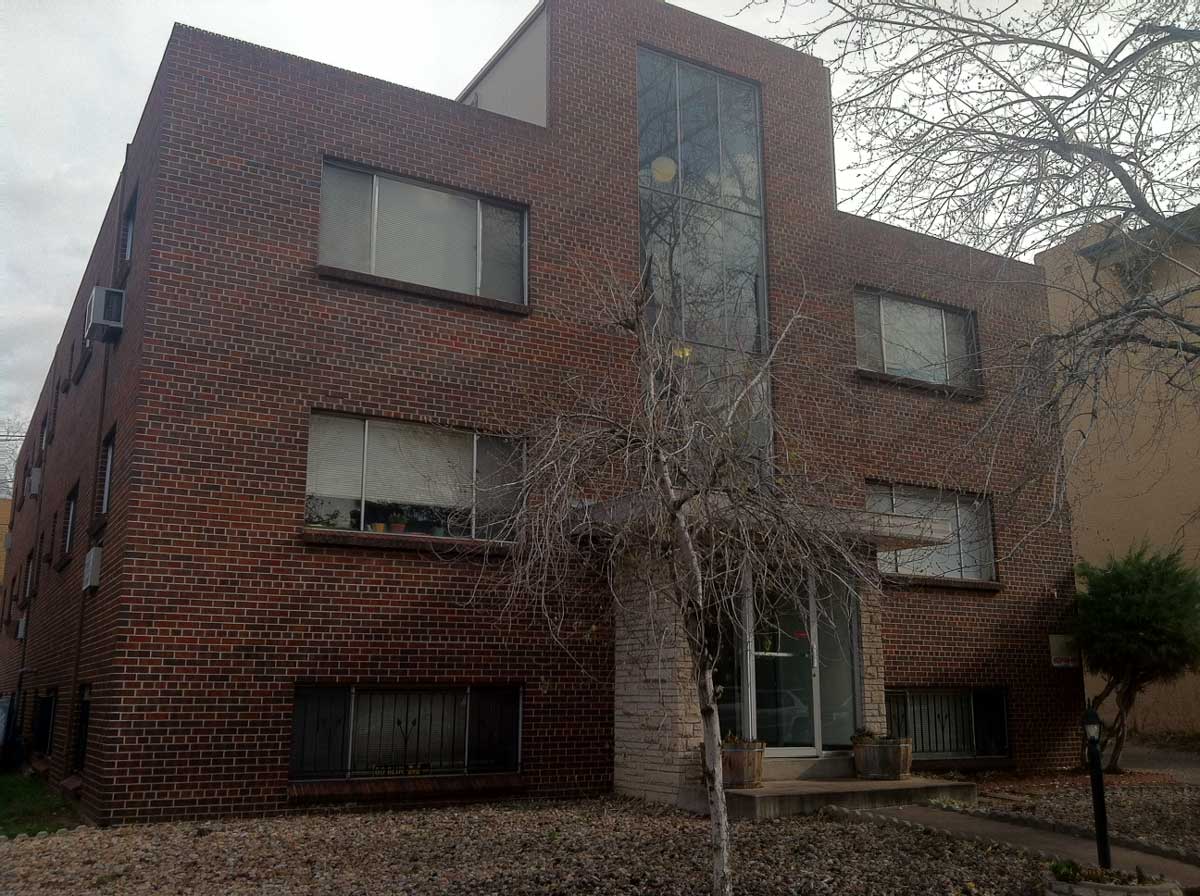
Rather than waiting for new development to catch up with demands, why not make use of creative design alterations? Every city has their share of less-desirable brick cubes. Lacking character, curb appeal and proper care, these are the places you drive past and desperately hope not to get stuck living in. However, Denver has done an impressive job of breathing new life into otherwise lackluster residential architecture through the use of creative redesign. The best part is that the successful result of this transformation appeals to the age-group in question. While rental rates remain relatively affordable, the neighborhood benefits from having one of its most understated, forgettable structures sculpted into a showpiece. Bold, urban and edgy, these newly refreshed designs more closely resemble their occupants.
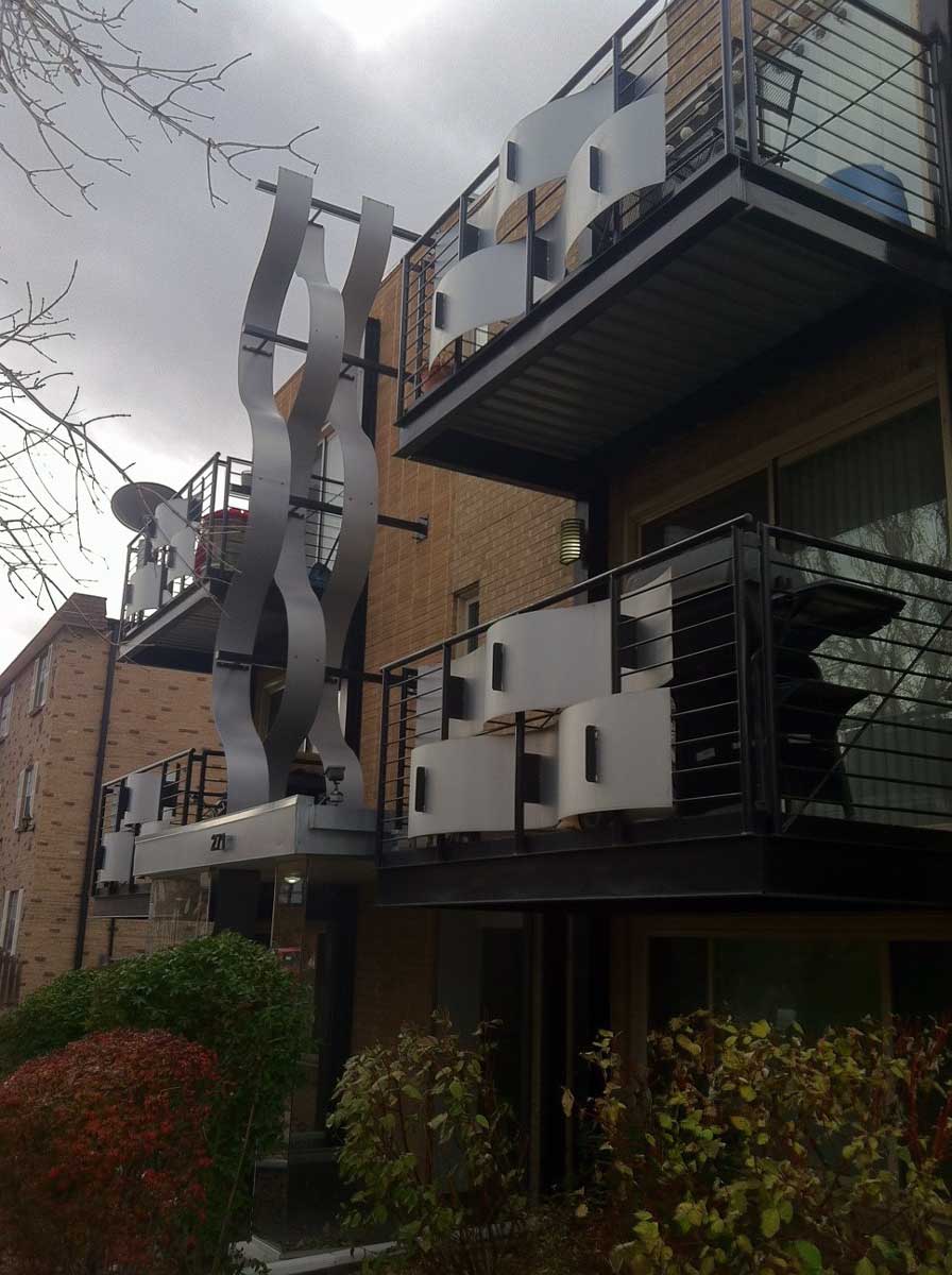
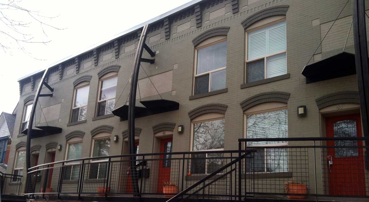
Though aesthetics and beauty will be valued and judged from a number of perspectives, it is important to recognize alternative possibilities. It is one thing to design a sleek space from scratch, but it takes a different eye to see the hidden potential of the plain and bland. These pictures show several examples of dated brick cubes and motels that have achieved more prominent curb appeal without undergoing a full reconstruction.
Beyond the benefit of visual enhancement, these soft architectural improvements allow for a faster transformation of the housing options while utilizing what’s already on the ground. In a neighborhood like Capitol Hill, there is less room for new construction than in other neighborhoods and still an ever-expanding demand for housing by young adults. With rent on the rise in the urban center, places like Capitol Hill will become even more competitive as more young people move in. Perhaps this is one way that developers, neighborhoods, and the city can continue to attract this growing demographic while simultaneously upgrading the identity of their building stock.
~~~
Derek Berardi is a resident in Downtown Denver. He graduated in 2009 from the University of Cincinnati with a Bachelor’s Degree in Urban Planning/Design. Derek has worked with Calthorpe Associates in Berkeley, CA, Perkins Eastman in New York City, and has worked for several government municipalities. At DenverUrbanism, Derek’s writing will cover the topics of adaptive reuse and cultural identity.


captions for the photos indicating address would be very helpful
The last building already has very nice architectural expression in its brick bones. Removing the curved piece and adding a “better” canopy at each unit entrance would cost similar and serve a practical purpose while not detracting from the simple but well defined brick detailing. Also, there is rarely a time that painting brick has any merit since it just adds a layer of maintenance to a material that is inherently beautiful and maintenance free (relatively). In my opinion, only when someone has already damaged the brick beyond repair should brick be painted. Some of the examples are better than others. But, I’m afraid haven’t yet warmed up to the idea of just adding stuff to a building unless it can also serve a real and quantifiable goal. There’s got to be a better way!
Larry,
I agree with you on the last photo. It was certainly a beautiful structure before it was altered. It could stand on its own without any additional bells and whistles. However, it was a very unique take on a row house that I have never really seen and gave an additional example of rethinking the possibilities when modernizing structures. In the end, I thought it was a fascinating concept, so I wanted everyone to see it.
As for the other buildings, I am convinced that this is a very valid way to put a fresh face on the architecture that was never that stunning to begin with. I understand that everyone has their own opinion as to what’s beautiful/desirable and what isn’t. However, I would expect the demographic moving into the neighborhood and the market to desire something that looks more appealing than the first photo. I just wanted to suggest one option for enhancing them.
What are your thoughts on alternatives? I am also curious how the brick cubes might have a second life. The soft alterations seemed safe in a way because they would be easy to add or remove. Thoughts? Thanks for your honest remarks!
-Derek
Hi Derek, I think that treating the windows differently, maybe replacing them with insulated units that have a different scale and proportion to them but stay within the frame that exists (i.e. adding four casement or double-hung windows in a really wide aluminum window frame). That would give a more vertical emphasis to the horizontal windows. Perhaps the tall glass wall at the center could be replaced with euro style insulated channel glass. Stosh suggested adding roof patios. Perhaps the added railing could be a new architecturally integral parapet. Just some ideas.
I recall when I first started seeing these modifications about four years ago, I thought they were pretty cool. But in less than a year a thought they had already run their course. I just don’t think they have staying power. When designing a building, you always realize that things which are added to the building to give it effect are the most likely to be value engineered out of the design and leave behind just the skeleton. So, it is important to make sure that the skeleton is successful. As you have already noted, many of these skeletons are lacking from the get go.
Except when they do these “alterations,” it’s always combined with a huge increase in rents. They “updated” an apartment building on my block with basically new paint jobs, appliances and carpets and jacked up the rent from $600-650 a month to $950-$1050..and these are for small, one-bedroom apartments!
I understand that market forces work to raise rents when the vacancy rates are low, but so often updating apartments really is just an excuse to jack up the rents and then where do these young, mostly underemployed new residents live when they are being constantly priced out of updated apartment buildings?
I like the boutique apartments building. Pretty understated, but gives the building a nice corner presence.
I really like the dark building (the one with the “Rocket” sign). I think the new touches integrate well with the old building and it doesn’t look out of place.
Some of the others, I’m not so sure about. In particular, the last one for the reasons already mentioned, but also, the one in the third pic with the wavy pieces of steel strapped to the facade. I mean, that just looks tacky – like when someone tries to pimp out a ’89 Civic by throwing a giant race-car spoiler on it. It just looks cheap and out of place. And I don’t think it will age well.
The first pic that was used as an example of a boring “brick cube” looks beautiful to me. But I guess I’m weird. Maybe I’m just a bit home sick having spent too long in a land of stucco, and the sight of a stereotypical, brick, Capitol Hill building gives me a feeling of nostalgia. Regardless, I can’t comprehend how the site of such a building would make anyone “desperately hope not to get stuck living in” it. Those are strong words. Perhaps you’re from the East Coast and “brick cubes” say something different to you east-coasters than they do to us westerners.
Freddie,
Thanks for the comments. I always think it’s interesting to get other peoples’ take on design since it is such a subjective topic. I knew writing this post would be comment suicide, but it was something that was on the ground in Denver that I couldn’t ignore. This type of rehabbing has stuck out like a sore thumb since I’ve moved here and I have trouble denying that it’s something unique to the redevelopment efforts. Needless-to-say, some efforts are done better than others. The one that you regarded as tacky, I can certainly relate to. I would not necessarily be signing a lease there any time soon. However, I want to open peoples’ minds to new possibilities. It’s always important to consider new twists and ideas. That, more than the design elements, is what stuck out to me. In a way, it is a developer trying to pursue the market through design…..whether he understands design or not. So I guess the discussion I was hoping to see spin out of this was what ways this could be successful or fail. Regardless, in a way, it is innovating an old concept with a new idea. That’s the take-away. What value people place on the result is out of my control. Thanks for giving the piece some alternative perspective! -Derek
The fourth pic (Skye Condos III) is growing on me. I still have mixed feelings about the shark fins but the balconies rock. They’re classy!
Thanks for posting this. I have mixed feelings about these buildings and their “soft alterations”. They seem anything but soft to me I think that’s the point, for them to stand out on their own and yet feel like they are from the same family, I especially appreciate when they have been able to incorporae larger balconies and awnings. The majority of the additions feel dated already to me but like you said, most of it can be easily removed in the future if desired. The 3 rd pic is My favorite and there is another interesting one at 13th and Columbine I have grown to like.
Additions I would like to see on these types of buildings include:
-New pained windows and French balcony and main entry doors
-Shutters on each side of all exterior windows
-A pop of color on the trim or at least 3 complimenting new colors if painted
– although pricey A Roof Top Deck with a nice railing around the top always adds value and much needed outdoor space.IMHO
oooh… they look so moderne. I’m sure that’s what they thought about the first one ( https://denverurbanism.com/wp-content/uploads/2011/11/2011-11-18_1.jpg ) back in its day. “Hey, lets not put any ornamentation on it…people will think it’s modern”. Thank god for stupid people.
Joe, I am lacking the message behind your comment. Are you saying that the first one is in some way offensive to you for being lackluster or that there are design qualities to be appreciated? I can see both sides of that coin, but I was just curious of your feelings on it. -Derek
I loved my condo in a boring brick cube at 1200 Emerson Street. It wasn’t “sexy” but I got a 650 square foot unit with a balcony for $85,000. The Sky units were selling for $120,000 at the time and were out reach for my then $30,000 salary. It was a decent place to live and buildings of the vintage were constructed of better materials than 2000s buildings.