Over the past few weeks 1801 California has been stripped of its Qwest logos and has had CenturyLink logos installed. They are now lit up and shining a new color that can be seen for miles.
The new logos are not just letters like the old Qwest signs. There’s now a new green circle.
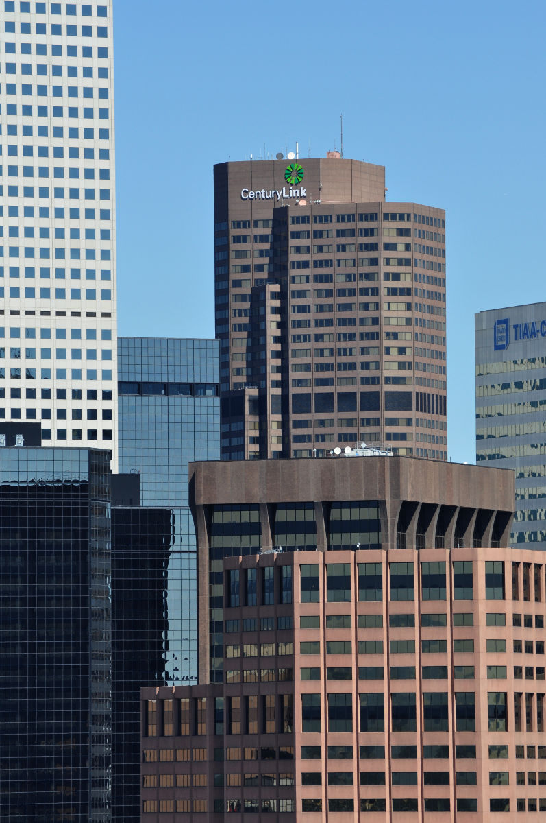
The type is a lot smaller than the old logos so you do have to look a little more carefully to see what is on the building. Below is a good example of that.
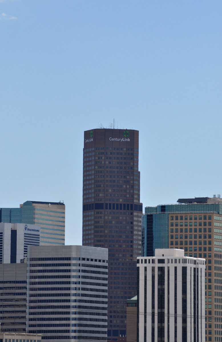
I had a very difficult time taking a picture of the skyline at night without the logos washing out. The same goes for the new Bank of the West logos on the Dominion Towers.
With some extreme darkness and faster shutter speeds I was able to get a clear shot of the logo at night.
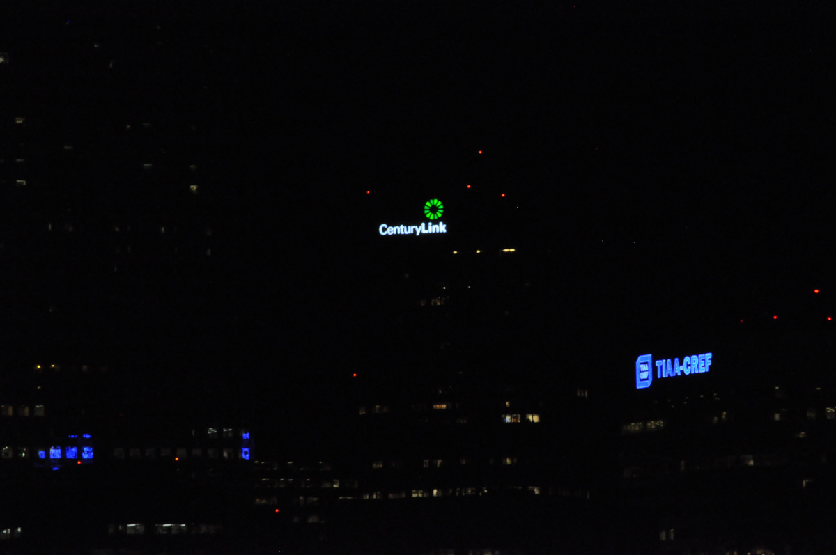
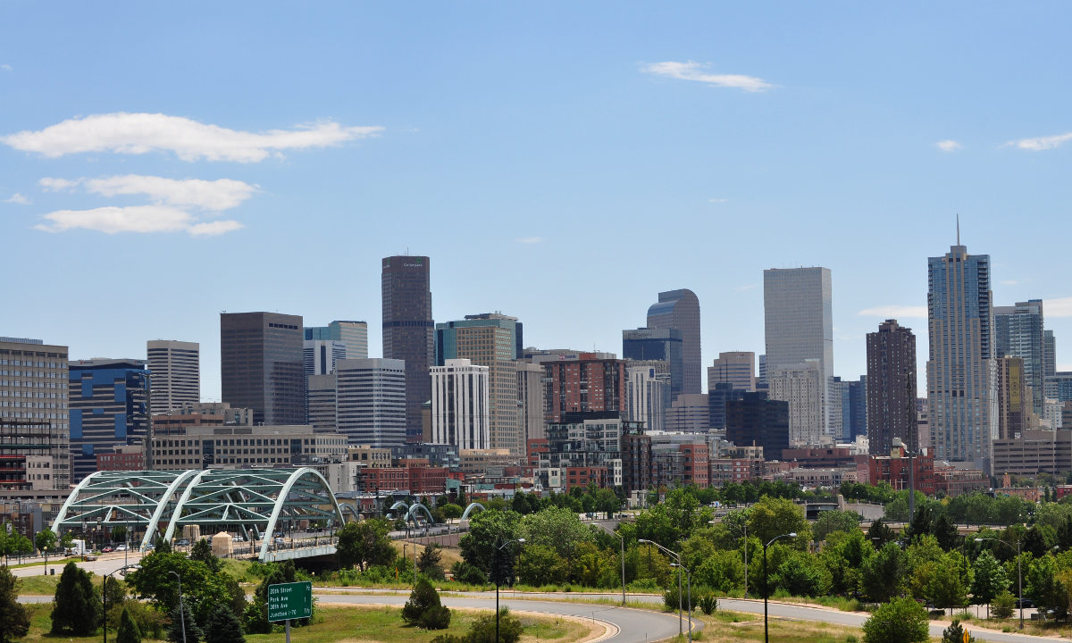
It is a big change on our skyline even if it isn’t a new building. Do you like the new look?


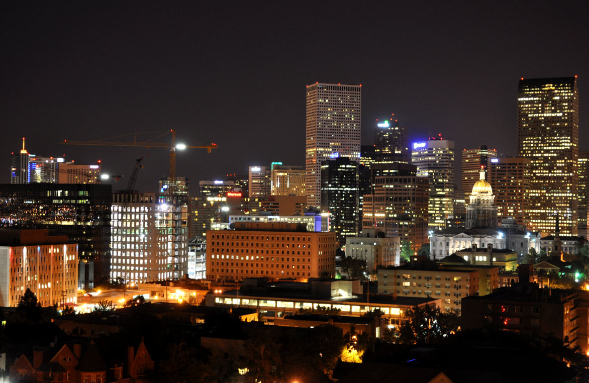
I don’t mind the new look and actually find it more appealing. However, their logo is the similar to the animated circle you see when you are waiting for something to load on your iphone (their version of the dreaded hourglass). Not the best marketing for Century Link. They really left themselves open as a target – “takes a century to link”. I’ll be the first to admit however that their connections are lighting fast since they laid fiber on my street.
TIAA-CREF, you now monopolize the blue light segment of our skyline. Enjoy.