Time to take a look at the brand new 22-bay bus terminal at Union Station, which is set to open on May 9, 2014.
For those that don’t know, the new Union Station Bus Complex will replace the existing Market Street Station at 16th and Market Streets when it opens its doors next May. The new station is situated along the 17th Street axis and spans essentially the entire length between the western face of the historic Union Station building (soon to be the Crawford Hotel) and the Consolidated Mainline (CML) tracks.
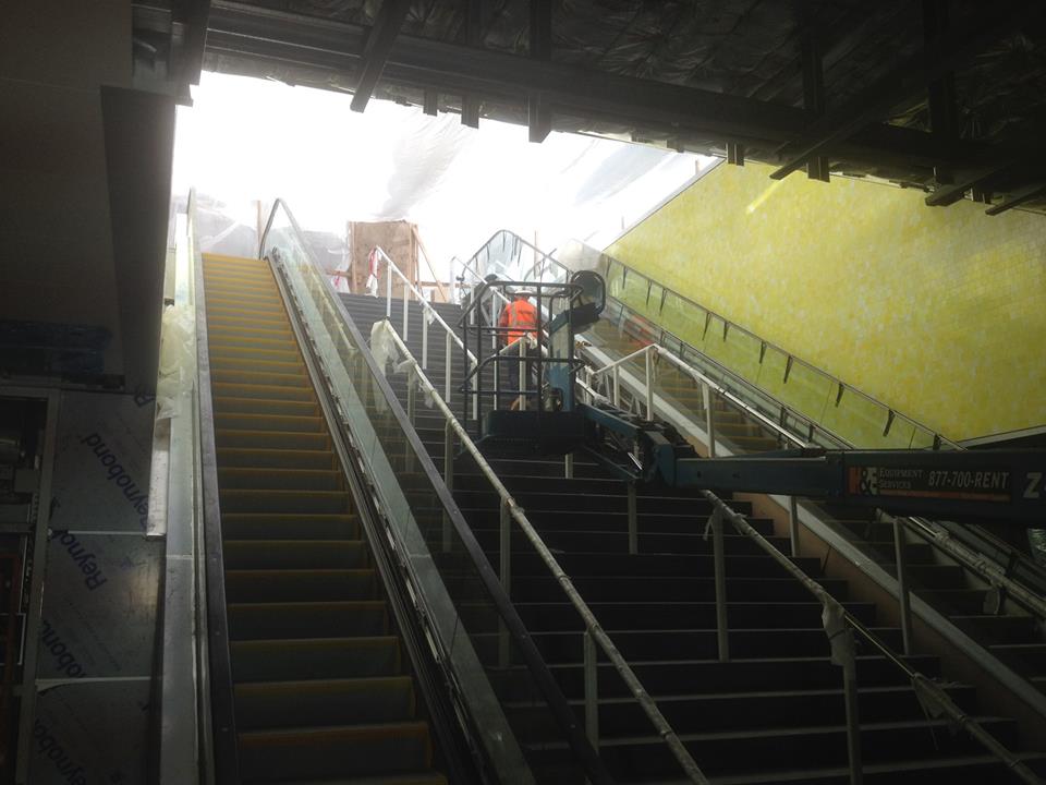
There will be multiple entrances into the bus station – we’ve got escalators, elevators, and stairs on either end of the station, as well as other stairwells in between. As you can see in the pictures below,
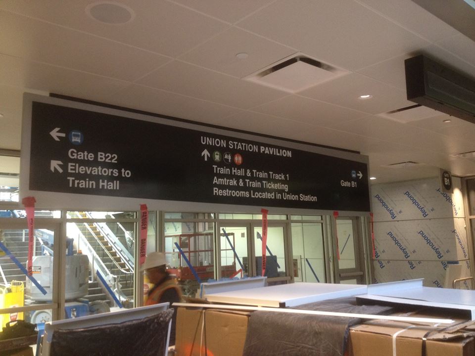
The wayfinding signage in the station has been installed and is really clear and easy to read – much better than the wayfinding signage at Market Street Station (does it even have any)?
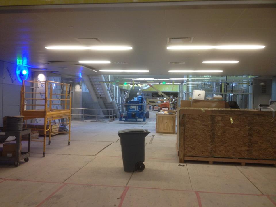
The bus complex looks more like an airport terminal to me than a bus station, at least right now. It’s wide, spacious, and the skylights above do a great job letting natural light down and into the station – also a HUGE improvement over the bunker that is Market Street Station. Speaking of the skylights, some Darwin Award hopefuls have been grinding down the lights on their skateboards and have broken one of the windows in the process. Luckily, the glass is tempered and didn’t fall into the station. RTD is fixing this and will ensure that doesn’t happen anymore. Additional security patrols are also in place.
The floors of the station have a cool terrazzo flooring, which RTD says will hold up well to the glut of passengers expected to utilize the station. It’s simple in terms of design, but helps delineate static and dynamic areas within the station.
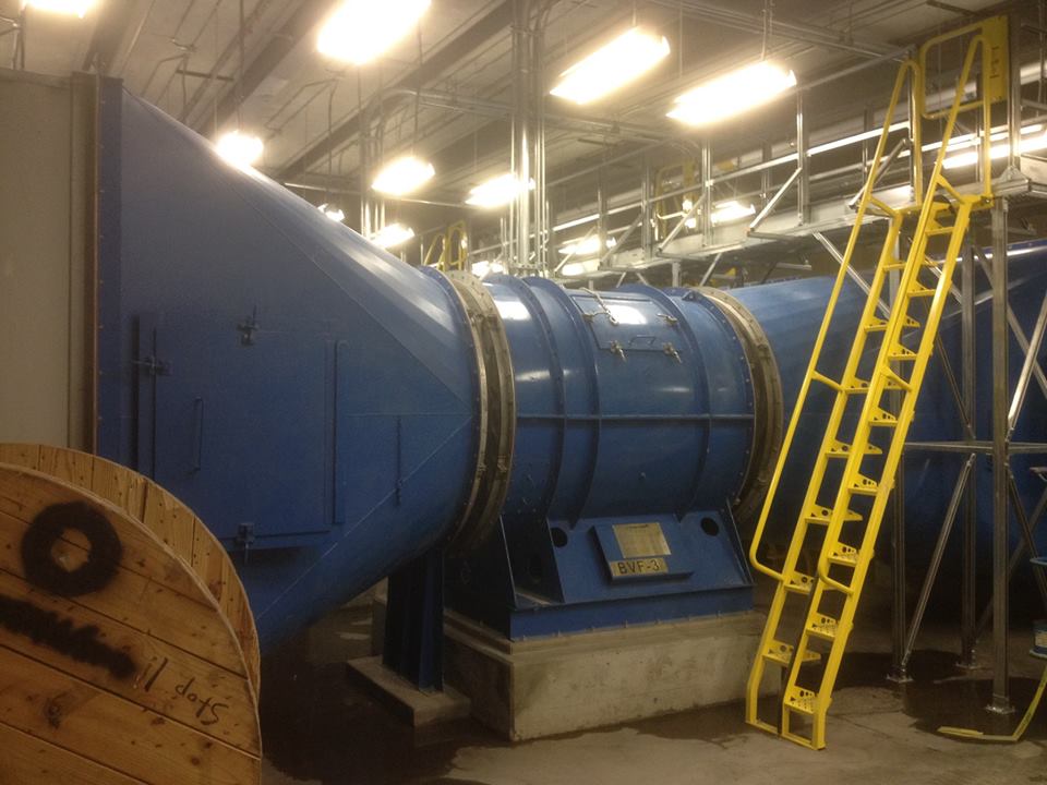
A 22-bay bus station obviously has its fair share of diesel exhaust. To clear the air, RTD has installed MASSIVE vacuums to help suck the dirty air out of the bus concourse. The picture is a little misleading. The vacuums are so large, I couldn’t even get the whole thing in one picture.
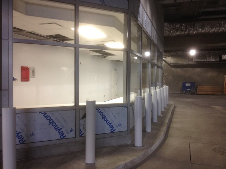
For those of you familiar with the Market Street, you’ve certainly seen the dispatcher kiosk that greets all the incoming buses. At Market Street, it seems like an afterthought and is crammed into the corner of the station. The is certainly not the case the new station – dispatchers essentially have the entire western end of the terminal to themselves.
There is no doubt that this massive bus concourse is a HUGE improvement over the current situation at the Market Street Station. It’s bright, airy, spacious, and will certainly be able to handle service demand levels well into the future. As I mentioned before, the station opens May 9, 2014 – only 142 days away!






Looks great. Do you know what they plan on doing with the old Market St. Terminal?
The developers of the surrounding US buildings get first dibs to redevelop the site.
Again, thank you Ryan for the great photos and information. Having lived in Denver for 18 years and now gone from it for 6, this blog keeps me informed and for sure I will tour Union Station area and the rail lines on my annual Denver visit!
As someone who spends time in Market Street Station twice a day, I’m very excited about this upgrade. I am very disheartened, however, about the way RTD is handling signage explaining our increasingly complex system. A few examples:
— They have a big sign saying “Train Track 1.” Oh—and by the way, that’s the train to the airport. Let’s hope you brought your decoder ring! At very least it should say “Track 1: Trains to Denver International Airport”
— In iconography, they make the distinction between commuter rail and light rail, as if people care what type of train they’re riding on. They’re even introducing green and blue as color codes for “commuter rail” and “light rail” which will not actually be carried through in the colors of the lines themselves, creating even more confusion.
— Most of the signs are pointing to things that are mostly inside baseball and have nothing to do with transit (Wewatta Pavilion) rather than talking about transit things (e.g. Line W toward Golden).
This is just like at the airport where they have signs all over the place saying “RTD Bus” rather than “Public buses to Denver and Boulder,” which would be much more clear to the thousands of daily visitors who do not know the cryptic acronym of our local transit agency.
I’m still optimistic about Fastracks, but this stuff really matters to make transit systems clear. Sadly, RTD consistently gets it wrong.
Take it easy, man.
The DIA trains won’t run until 2016, so it’d be misleading to label the Track 1 platform as you propose right now. The commuter and light rail lines operate at opposite ends of the station, so the visual reinforcement of the difference isn’t necessarily a bad thing. And I’m sure that there’ll be maps and such to further disambiguate where things are.
As for today’s SkyRide service, most of its users are probably locals familiar with what RTD is — and there are plenty of hints (and friendly greeters) for visitors at the airport. Denver and Boulder aren’t the only cities served by those buses.
I tend to agree. We don’t know yet how RTD plans to market the Commuter Rail do we? Their website currently separates out “Skyride” bus service from regular bus service, so I’m not so sure that they won’t separate out commuter rail from light-rail as well and show them on different maps. They may even go with different route-designations than the “E” “C” “W” designations given to light-rail.
But more importantly is that some of these marketing factors may be subject to future change. Or perhaps they will start running trains to DIA from other commuter rail lines using DUS as a through station; for example an “A” train going from Arvada to DIA, and a “B” train going from South Westminster to DIA ect… any such change in service or expansion in service would require a re-allocation of platforms, so simply labeling the platforms seems like the safest long-term approach.
Plus, I’m assuming there will be information booth(s) at the station, so anybody hopelessly lost can simply ask somebody which platform their train leaves from.
I believe we do actually know what the branding will be, they will be calling it commuter rail, to the confusion of everyone.
This was posted by RyanD on Skyscraper page.
http://farm6.staticflickr.com/5528/10639521896_435a2762c3_b.jpg
I think Ryan N. brings up some good points. Most transit systems seem to use too much insider jargon or branding and not enough plain directional language. In some cases, the original branded language, colors and logos (like the “Skip” in Boulder) become well known and are useful. In many cases, however, they just confuse people – especially visitors. Terms like “Wewatta Pavilion” will probably eventually become meaningful to frequent transit users in Denver, but they’ll always be confusing for visitors. “RTD” is another term that seems overused, especially at the airport. RTD probably wants its name on things for political visibility, but other terms like “local transit” would be much more meaningful to visitors and casual users.
The distinction between light rail and commuter rail is an interesting one. I agree that most people don’t care. Should it all just be “rail” or “train”? Little icons indicating light rail trains and commuter trains are probably going to be pretty meaningless to most people who are more interested in “Airport”, “Lakewood”, “North”, “South” or other basic practical/directional considerations. In Denver, however, there is a meaningful distinction between light rail and commuter rail: Light rail goes mostly south and arrives at the far west end of Union Station, while commuter rail goes mostly north and arrives at the east end of Union Station (ignoring for now that they both go east and west to some degree). Is there a way to use this distinction to clarify things (i.e., light rail is “South Metro Rail” and commuter rail is “North Metro Rail”, each with their own color scheme, etc.)? I’m sure someone could come up with a better idea that takes the east/west overlap into consideration…
Or – perhaps it’s better just to say it’s all rail, or “FastTracks Rail” if it needs a brand, and try to name things based on where they go. In that case, the signs in the underground concourse would point in the direction of “Rail to Airport, North Metro, Northwest Metro, and Wheat Ridge” and “Rail to Golden, South Metro, etc.” in the other direction. When you got near the platforms they would say things like “Track 1: Airport Line” as Ryan N. suggested.
These are just ideas rather than specific criticism. As others have noted, RTD is probably still trying to figure out how to describe and brand the full system, including the commuter rail. Much of the signage will likely change in a few years. On a positive note, I think the new signage is nice looking and easy to read!
Here’s an article about L.A.’s plan to provide more consistency in the design of future transit elements: http://www.latimes.com/entertainment/arts/culture/la-et-cm-metro-station-architecture-los-angeles-20131231,0,639527.story#axzz2p5cWI3YY
Ryan, first off. Huge fan. I enjoy your art.
I do have to say that I completely agree with you. But I guess that’s why they put the information centers also. I wish details were clear lol. maybe track 1 … detailed as you said, but with, for now, 2016..or something.
keep us informed.
besides, comments are just that. RTD needs to get back to the AWARD WINNING PUBLIC TRANSIT SERVICE it used to be. . .
This is all good. If you look at the DIA signage overall, it’s pretty clean and clear. This will evolve at Union Station.
It looks high-end and the touches of brass feel hefty enough for big crowds. Millions of people will move through here. They will come and go in two giant commuter waves a day and long heavy weekends. Think of the pedestrian effect on streets radiating out for more than a mile. All the bikes. Union Station will always be open with people, even late at night. Buses, cabs, red-eye trains to planes. The crossroads.
The sidewalk web, weaving the city together. Street life. Union Station the heart.
Ryan, thanks for your work in posting the pictures and commentary. Very helpful. Although I am a local and really only take the light rail trains, I’m looking forward to seeing the inside of the bus terminal. Anyone know what is happening to Market Street Station when the new bus complex opens? Thanks!
This station looks great, I can’t wait to check it out when it opens. I used the Market Street station for the first time the other week, it wasn’t as bad as I was expecting but this looks to be a huge improvement.
Will there be places in the train station to buy refreshments? I understand that they don’t want people to have food and drinks on the buses but a coffee while you’re waiting to leave or after you arrive would be really nice and a solid revenue stream for them.
I say this without hyperbole, it will be embarrassing if they don’t allow riders to purchase tickets with credit cards. I still can’t believe you can’t buy a light rail ticket with only cash.
Ryan–totally agree.
Mckillo–having to use cash only for light rail–absurd and archaic!!! And infuriating. BUT, they finally just changed and credit cards finally allowed
Well, as long you know what Track 1 means… What you really want to know is WHERE to go and WHEN to be there to get to your destination. Therefore, displays like this would be the solution:
http://media05.myheimat.de/2012/05/28/2124918_web.jpg?1338237191
It’s in German, but you can see it combines bus and rail info. The track is indicated on the far right.
I do hope they do away with the silly RTD Bus language. You can still have the logo plastered on the sign, but RTD adds no informative value, it just confuses visitors.
Oh and they better have places like this: http://www.derwesten.de/img/incoming/origs4182550/1513739544-w552-h2700-/opomme.jpg and open after 9pm. One can dream, no?