Do you know which RTD bus routes come often enough to take without worrying about a timetable? This new map illustrates exactly that, by adding bus routes that come at least every 15 minutes all day to the well-known FasTracks rail map.
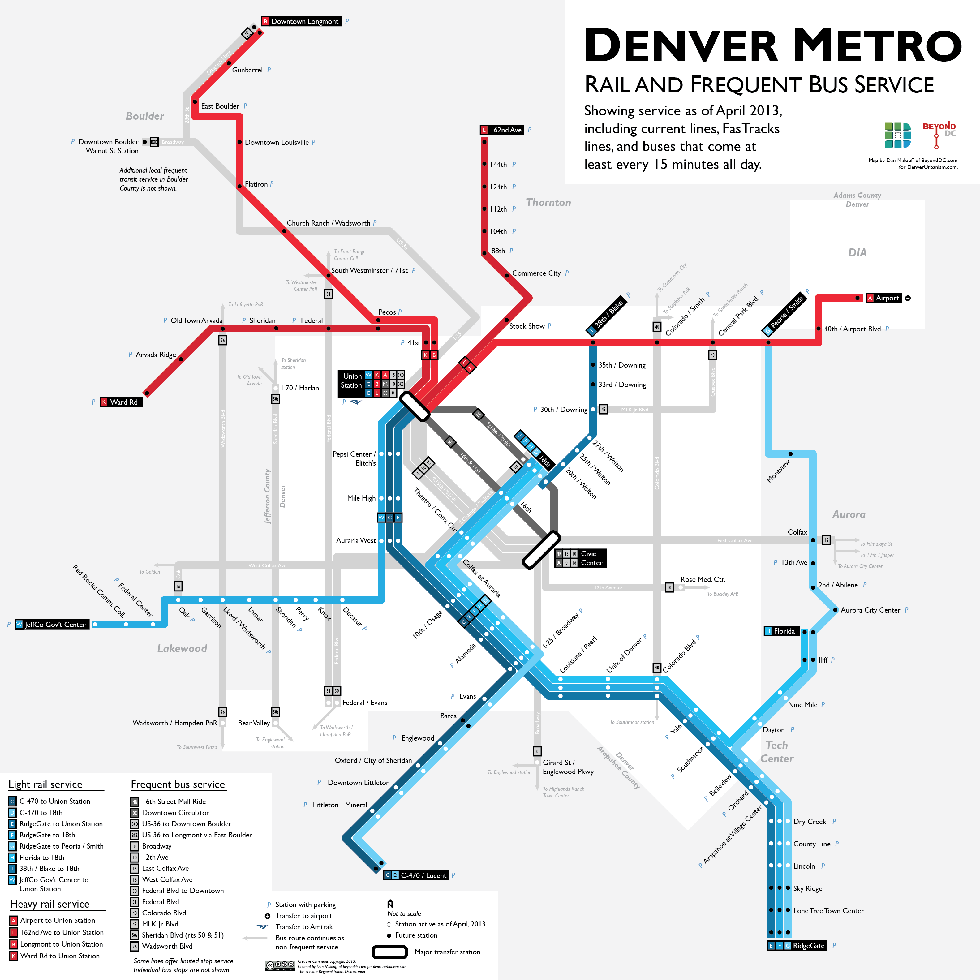 Denver rail and frequent bus map, by Dan Malouff. Click map for larger version. Many sizes available via flickr. |
Big city bus systems are complex and hard to use. With scores of infrequent routes going every conceivable direction, RTD’s buses are no exception. Rail systems, by contrast, are comparatively easy. Simple maps make it easy to remember where rail lines go, and trains come often enough that riders can simply show up any time and trust a train to be nearby.
What if we thought of buses the same way? We can, through the magic of frequent service mapping.
Most big bus agencies, including RTD, have a few key routes serving the most important corridors with buses that come as often as trains. Most potential riders don’t know which routes those are, because they’re hidden amidst the clutter of complicated bus maps that show every route. When bus lines that come every hour are illustrated the same as those that come every 10 minutes, people have to assume the worst about all the routes they don’t personally already ride.
But if riders are educated about those key high quality bus routes, and think of them as practical options just as easy and convenient as the train, more people are willing to ride. Frequent service maps like this one are geared towards that purpose. They don’t show every conceivable transit service. Rather, like RTD’s light rail map, they focus on teaching riders how to use a limited but high quality portion of the overall system. More detailed information, including the less frequent routes, would still be available via other, separate maps.
Los Angeles pioneered frequent service mapping with its 15 minute map. Other cities have followed, including Washington, DC and even Salt Lake City, which still shows every route but uses different colors to indicate frequency.
For this Denver map, I wanted to show the frequent routes in as simple and uncluttered a way as possible. So I eliminated complications like one-way couplets, where a route uses parallel one-way streets, and clustered similar routes into similar colors. Light rail is blue, heavy rail red, and buses gray.
I tried to show FasTracks lines as they will exist when finished, although some of that is still up in the air, and doing so does result in some peculiarities. For example, my best guess about the Central Corridor through Five Points is that a streetcar will eventually replace light rail, but that isn’t how the line functions as of 2013.
When RTD opens the West corridor light rail line in April they will pair the rail opening with a series of bus improvements aimed at feeding ridership to the light rail. When that happens, buses on Sheridan and Wadsworth will begin to come often enough to qualify for this map, so I went ahead and showed them. Future FasTracks rail and BRT lines are shown, but stations that still won’t be open as of April are colored black instead of white. When those lines open RTD may well improve the buses around them too.
In the mean time, hopefully this map will help current bus riders identify other useful lines, and maybe help some non-bus riders take the leap.


This is really a great map and I wish that this was the standard by which RTD would use for their maps graphically. In the mean time, i have added this to my list of items that are genuinely critical when searching for a new home. Thank you Dan for the great work.
WIN. Many thanks!
While in your text you say that you want to promote bus usage you put the bus lines in gray thus letting them blend into the background. Additionally you put on so many lines that will not exist for years to come it makes this more about a theoretical far future instead of what is actually good and useful now. I applaud the sentiment of promoting bus lines, but it is at odds with what you actually made.