Our 15-part series exploring the geographic and architectural attributes of fourteen decades of Denver’s single-family detached housing is now complete. Here’s the final list of links to the entire series:
1870s (plus series introduction)
1880s
1890s
1900s
1910s
1920s
1930s
1940s
1950s
1960s
1970s
1980s
1990s
2000s
Whew!… this project was a lot of work, and it took ten months to complete. But if you haven’t figured out by now, I thrive on these types of efforts: telling the story of our amazing city by illuminating how Denver’s built environment developed and evolved over time.
First, a huge THANK YOU to my collaborator on this project, Mark Zakrzewski. His 200-plus photographs expertly reflected the changing nature of Denver’s single-family housing stock, and his well-researched descriptions of dozens of architectural styles added a dimension to this project that could not have been captured by maps alone. My appreciation also goes to GIS experts Ron and Chris at Matrix Design Group for helping me put together the original parcel data in GIS.
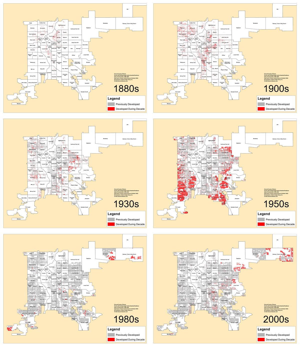
So, let’s take a final look at how Denver expanded geographically through the development of hundreds of subdivisions over a 140-year span. Here are the two maps we featured throughout the series as animated GIFs. First, the map with the neighborhood boundaries. To view this a much larger scale, click here to open the image in a new window, then expand/zoom if you’d like.
Next is the map with the GoogleEarth aerial background, with the decades being added in a cumulative manner:
To enjoy the aerial map at the parcel level in GoogleEarth, click here to download the KMZ file. For you to use the KMZ file, you need to have the GoogleEarth application installed on your computer (which, if you don’t, you should since GoogleEarth is absolutely awesome and free!). After ensuring GoogleEarth is up and running, download the KMZ file and double-click on it. The red housing data layers, plus the City & County of Denver yellow outline, will appear in GoogleEarth. From the sidebar, you can expand the folder and turn the various decade layers on and off or change the color or opacity of any layer as you desire. Have fun!
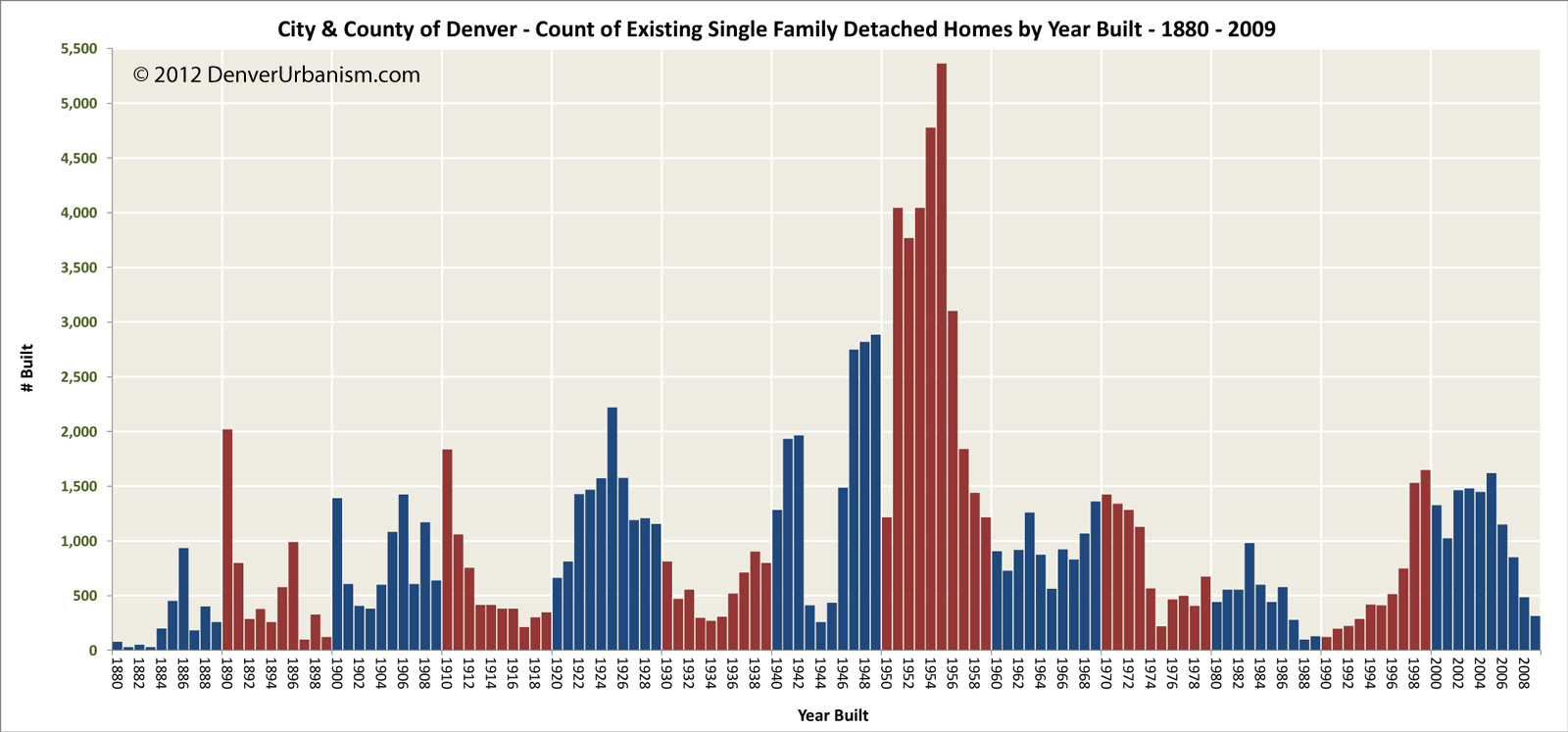
Finally, here’s a chart showing the number of homes built by year over the fourteen decades. This histogram beautifully reflects the economic and political history of Denver and the nation and the many wars, booms, and busts that influenced the number of homes built annually in the city. You can also easily observe the cyclical nature of real estate. Since 1910, Denver’s been on an almost-perfect 15-year cycle of peaks and valleys in the count of single-family detached homes built. The vertical bars are alternately colored red and blue simply to more easily distinguish the decades (click to embiggen):
For information on the analysis methodology and data accuracy, please be sure to read the series introduction in the 1870s post and, in particular, the July update at the bottom of the post. Also, the maps and chart above begin with the 1880s, as there were so few (25) homes remaining from the 1870s that they would not be visible on the maps or the chart at these scales.
That’s it, folks! I hope you enjoyed this series. Thank you for your patience over the past ten months. I’ve added a permanent link to this series under the Pages section on the right sidebar. There, you can also find information about the additional analysis I’ve conducted on this decade-by-decade housing data.




When Ken showed this progression, our class erupted in applause. First time in my school experience that a class spontaneously applauded a teacher. Good stuff, this.
Very impressed.
Amazing series, I really enjoyed it! I’ve made these two comments on previous entries but I think they’re worth repeating… For one I think this would make an amazing book if it were formatted for publication. Second (though I understand this must be incredibly time consuming), I for one would be incredibly interested in a companion series about Denver’s commercial/retail/mixed-use structures. Thank you again so much for the time and effort! It was very much worth it!
A little late on commenting about this, but I just wanted to let you know this whole series was amazing. I’ve shown it to lots of friends and everybody has been impressed. It’s quite fascinating. Thanks for taking the time to do it!